Seed Grant Summer 2024 Report
Gillian MacDonald and Morgan Fox
Background
Inspired by more recent developments in the field of network science and early modern studies, Networking is a nascent open access digital repository of code and data specifically related to relationships and networks of people in Scotland during the Revolution. The recent publication of Tudor Networks and Stanford’s Mapping the Republic of Letters project are important contributions to the growing field of network analysis in the early modern world. These datasets have asked important questions about early modern communication systems and social networks. The communications revolution between 1450 and 1700 transformed the capacity for Europeans–and those in the British Isles–to communicate and engage with each other. Gutenberg’s printing press and the network of universities around Europe provided useful channels for books, ideas, and letters to travel from country to country. During the late seventeenth century, the evolution of newsletters and newspapers allowed information to travel more quickly along those networks. Historians have argued in the past that relationships and group dynamics are important in reconstructing moments of watershed. One particularly important way of visualizing this is through social networks.
A network approach allows us to focus our attention primarily on the interactions within any given system – whether that be a world of letters, journeys etc. The bigger the data however, the harder it is to deal with. Our database is one corpus of letters–there are 600 letters–centered around one particularly important figure at the time, George Melville, Lord Melville the Secretary of State for Scotland. The letters exchanged in this period are more than just networks of correspondence; people were bound together through community, print, and dialogue. Exchanging letters in a period of chaotic and often violent warfare was even more complex. Context is everything in understanding people, groups, identity, and behavior in the early modern world. Given this, understanding the relationships is paramount to visualizing the data. Behavior, relationships, and identity changed over the course of the Revolution and Networking Letters of the Revolution sought to trace those changes and connect historical networks with visual interpretation by building a new database and visual representation of the interconnected nature of communication. In the last 25 years, there has been a noticeable shift from historical records remaining piecemeal or fragmented in boxes in archives to a sea of digitized images and texts in the form of PDFs or PNGs. A number of manuscripts are now available online, including the Leven and Melville Papers. Our goals in this project were to:
- Visualize the world of communication from a corpora of letters.
- Understand communication patterns during conflict and a regime change.
- Parse group dynamics and information distribution from a chaotic period of transition.
- Democratize the pursuit of knowledge and expand the potential for research in this area of research.
Description
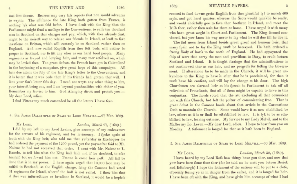
This project is a marriage of early modern Scottish history and computational data science. It brings together methods of network science, prosopography, and traditional early modern political history surrounding communication. We applied for the Seed Grant to begin working with the data and create an open-access project that scholars and researchers interested in the project can access and visualize the world of communication during this moment in history. Phase one required turning qualitative data into quantitative data. We started by recording all of the pertinent data from the PDF version of the Leven and Melville Papers [Figure 1].
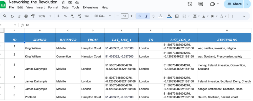
We then turned this data into spreadsheet data, here we used categories: Id, Sender, Receiver, Location from, Location to, Latitude and Longitude, Type and Date. This allowed us to parse the networking data in the form of nodes and edges. The data was then cleaned using OpenRefine to split up latitude and longitude and keywords into different columns; we also made sure there were no blank tiles and duplicates. After creating a master spreadsheet information file, we then set about creating different sheets for different visualizations including people, places, keywords, nodes, and then edges (relationships). We were able to get all the data from the 600 letters contained in the digitized copy of the Leven and Melville papers into the csv file [Figure 2].
After some experimentation with different tools, we decided to create visualizations using Python’s networkx library, Leaflet.js maps, and the data visualization tools Flourish and Gephi. Nodes represent important data points such as people, events, and groups; edges represent the connective tissue between those nodes and help illustrate the relationships between them. We also experimented with directional, radial, and regular network graphs.
Outcomes
Given the large dataset of Network Letters, it allowed for exploratory data analysis and investigation on different digital tools to identify the best representation of the relationships presented in the papers. One of the main tools we ended up using was the programming language Python; which contains a large number of libraries that extend the capabilities of the language, allowing for complex visualizations of the Network Data. These visuals were created on Jupyter notebook, which is an open-source software for interactive computing. In addition, we experimented with tools such as Leaflet, Flourish, and Gephi for further analysis of the letters.
Networkx Library
The networkx library enables us to make network graphs to explore patterns and structures within our data. Our project implemented the Girvan-Newman algorithm, which is used to detect communities (occurrence of a group of nodes that are more densely connected/or betweenness centrality). This is done by importing network algorithms and by iteratively removing edges that are on the shortest paths. Then the nodes are given corresponding colors to highlight their community. This algorithm is important for understanding the network graph because a node with higher betweenness centrality (shortest path importance) would have more control over the network, due to the fact that more information will pass through that node.
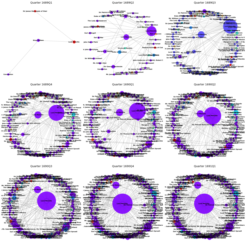
This quarterly visualization shows just how connected the people in this corpus of letters were over the course of three years. Lord Melville is depicted by the large purple node present in each diagram as both a sender and a receiver of letters – since he is either the letter writer or letter receiver in 510 of the 600 letters within the corpus. Lord Melville has the highest infrastructural role in the network, followed by the Duke of Hamilton (High Commissioner to the Scottish Parliament), his successor the Earl of Crawford, and then the monarch himself. This is unsurprising since the monarch and their principal secretaries tend to be the same epistolary hub. The quarterly graphs also show how correspondence became a very crucial part of the information network during warfare.
Leaflet
We were also able to create a leaflet map generated through Jupyter notebook by using the Python library Folium; a wrapper around leaflet.js to create interactive maps. The map was initialized by applying the coordinates from the network data to create a base map. We then constructed markers that are represented by the senders and receivers of letters that contain a popup with additional information when the marker is clicked. Furthermore, the use of the tool “MarkerCluster()” allowed the map to handle many markers by grouping them into clusters, granting us the ability to view different group dynamics. The visualization shows dense networks of letters across several kingdoms – Scotland, England, Ireland, the Netherlands, and France – most concentrated in Edinburgh and London. This disproves the notion that the King had either no idea or was not interested in the northern kingdom.
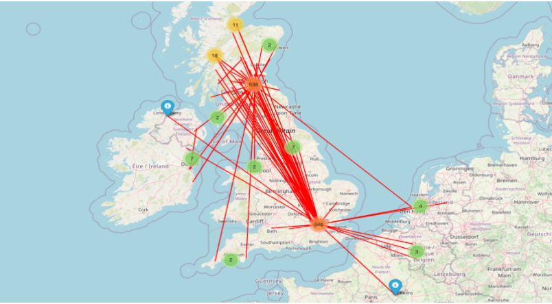
The leaflet map above displays a cluster of markers highlighting various historical locations in which the letters were exchanged. The map makes evident key figures and places from the data as we see a large distribution between London and Hampton Court emphasizing Melville’s significant role during this time. Additionally, the map is interactive and will soon be available for dynamic exploration for the user to see a general view of the data or zoom in for micro details such as who sent and received letters at specific locations.
Flourish + Gephi
Flourish is an interactive data visualization tool that permits complex visuals through a wide variety of templates. By simply importing the network data into a desired theme, Flourish creates a detailed visualization where we can further analyze relationships displayed from the letters. Flourish also allows us to customize and fine tune our data and graphs for more specified results. Figure 5 or the radial network of Melville’s correspondence shows that his network was widespread but generally concentrated with other high-ranking ministers and military officials.
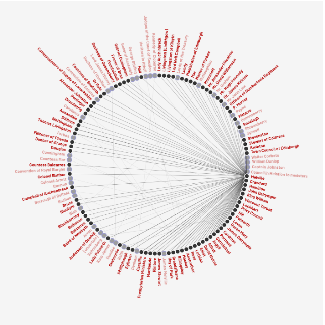
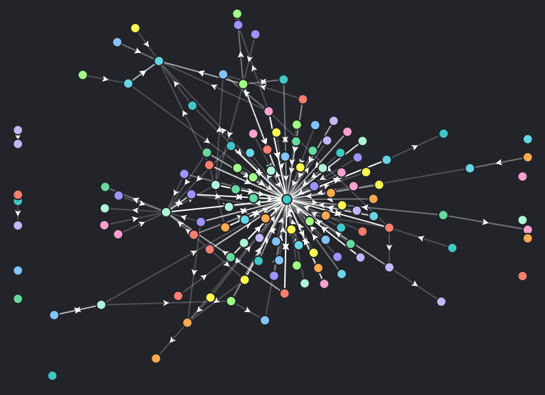
Figure 6, our directional map, shows the breadth of the network of letters. It also shows that the Leven and Melville corpus contains letters not specifically directed to Melville and intercepted letters or anomalies. Many of the networks were two ways but this is an incomplete view of the social network because as stated in the manuscript letters themselves many were destroyed or stolen in the period.
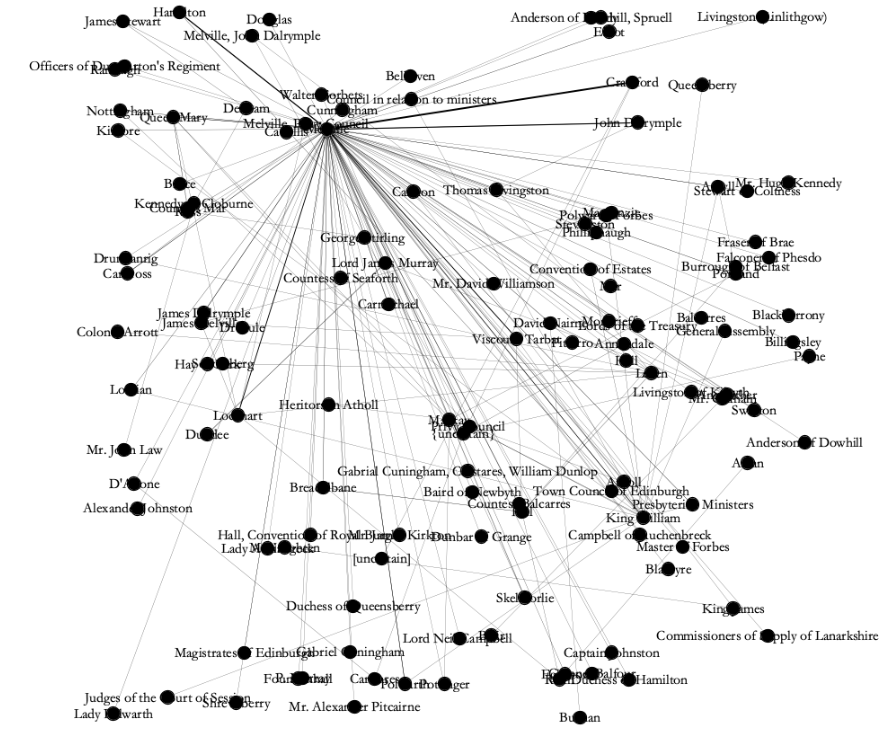
Gephi visual shows the complicated web of communications that took place in this short span of three years. The randomized graph shows the degree of connectivity between certain nodes. For example, Melville has heavily weighted edges with Crawford (79), Hamilton (44), John Dalrymple (42), Tarbat (34), Lockhart (33), and King William (18). This is not very surprising since Crawford, Hamilton, and John Dalrymple are crucial members of the Scottish administration, Tarbat was a Jacobite convert to the Williamite cause, Lockhart is the Solicitor General for Scotland and William is the newly installed monarch. All of the data (csv files, visualizations etc) are now housed in an open-access GitHub repository. The repository is open to the public so that other scholars can access the material.
Future Directions
Networking Letters of the Revolution is a nascent prototype project with potential to grow considerably. Melville and Leven’s corpus of letters alone constitute approximately 650 pages of material and there are several manuscript counterparts. Future directions in this project include adding manuscript letters not currently held within the Leven-Melville papers, expanding upon the range of correspondence. We also aim to integrate other key members of the network to offer a more comprehensive view of the data. Furthermore, expanding the project to encompass the entire letter network during this three-year time frame would provide meaningful and in-depth insights on the complex interconnections between people’s lives during early modern society.