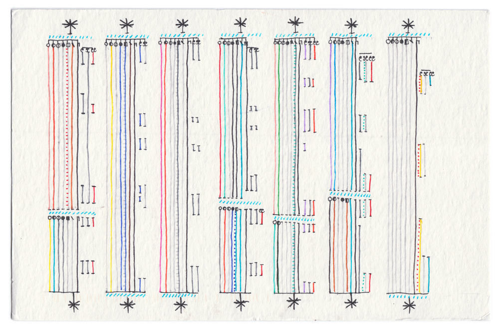
As a I prepare to travel to Indianapolis for the HILT (Humanities Intensive Learning and Teaching) Institute, I’ve been reflecting on my connection to Digital Humanities research and pedagogy. As a researcher of visual/digital rhetoric, I have been consistently fascinated by the ways researchers take diverse data sets and communicating the findings visually. The data visualizations I find most interesting are industry-based, like Graphic Designers Surveyed by LucienneRoberts+ and Stefanie Posavec, or Posavec’s blog-turned-book Dear Data. Partnering with Giorgia Lupi, Dear Data catalogs a weekly data visualization based on the personal aspects of Lupi and Posavec’s lives. My favorite week was “A week of getting dressed” (see above). Despite how much I am intrigued by these visualizations, I haven’t turned to data visualization much in my own research. My hesitancy is based entirely on the sheer volume of technologies and tools that are available–what technology is most appropriate for my data? Does this technology align with my methodology? Where do I start?
Because I have all these questions, I am both excited and relieved to attend the HILT session “DATABASE DESIGN FOR VISUALIZATION AND ANALYSIS” with NICOLE COLEMAN. This session focuses on predesigning data models before attempting visualization, and promises to teach me how to collect, create, manage, and manipulate data in a variety of forms (maps, network graphs, charts). There is also mention of using data-magic-tool OpenRefine. This session is five, intense days so I know I will learn SO much about visualizing data from my instructor and from the other HILT students.